Visualizzazione post con etichetta green. Mostra tutti i post

venerdì 27 febbraio 2015

Green and black nail art


 Hello! Today I want to show you a nail art inspired by this. Don't you miss Nailside? I do.
I didn't want to use pink, so I used Essence L.O.L., my favourite lime green creme, topped with essence Stamp me! black polish. Nailside covered it with a matte topcoat but I left it shiny (with Seche Vite obvs.). These geometric shapes aren't as easy as it seems, especially since the tape I use doesn't stick to the nail as strongly as I wish. Still, the result ain't that bad!


martedì 17 febbraio 2015

Sugarpill Heart Breaker palette review

Look, I'll understand if you think it's pointless to review a product that beauty bloggers allover the world own and love. But still, here's my 2 cents about this super-beautiful palette.

They win all possible packaging contest from here to eternity.
But packaging aside...
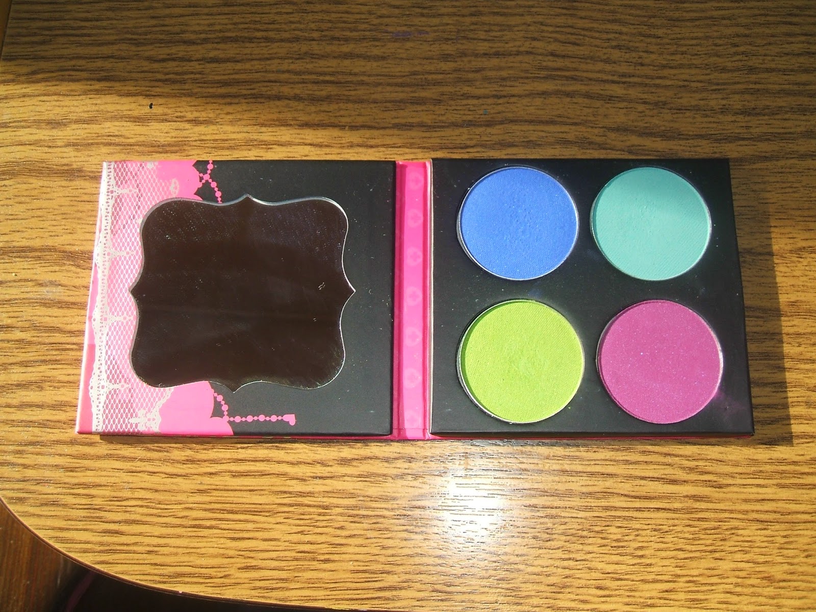
Colors are Acidberry (acid green with subtle shimmer), Velocity (electric matte blue with subtle shimmer), Mochi (ultra matte seafoam) and 2am, (matte purple with soft shimmer). In the swatches I've done they don't appear much pigmented but they're actually pretty great. Mochi ended up being a personal favorite, it's ridiculously good. With primer and a white base to help the colors stand out, these will last all day perfectly. They blend like a dream and are just ... super pretty.
My swatches don't do these pretties justice!
The Sugarpill website doesn't ship to Italy (huge surprise here) but you can get them through Cocktailscosmetics.
There are two other palettes like this, with different colors, if these aren't your cup of tea.
In my humble opinion everyone should try Sugarpill once in their lifetime.
(I also own the yellow eyeshadow, Buttercupcake, which is THE BEST.)


mercoledì 17 dicembre 2014

Revlon Wintermint

I always wanted to try those "scented" nail polishes by Revlon. And the cute bottles were a part, I'm going to admit it. However since I could never find them under 5 euros I always left them on the shelf with a sigh. After all, what if the quality isn't that great or the scent fades instantly?
But I found a Revlon store at the train station... who sold those for 2,90 euros. Now, that is what i call a good price.
I got only one because I wanted to test it, but I am probably getting more of them soon.
The one I got was Wintermint, a mint green (duh) with golden shimmer and blue microglitter. Even if it were scentless it would be nice in a collection, right?

I applied three thin coats of polish and no top coat, to see if the scent thing was real. Boy, it really was! My nails smelled of delicious mint and it was quite a strong scent! The thing I liked more was how relaxing the scent felt, it was really pleasing.
I've been wearing it for 3 days now, and not only it hasn't chipped, but if put my nails under my nose I can still smell the mint. Granted, it's not as strong as the first day, but it still feels nice.
Really satisfied about this, I can't wait to try some more, maybe Lime Basil.


domenica 5 ottobre 2014

Essence Hello Autumn LE 02 & 03 Nail Polishes


I have a confession to make: I have yet to learn how to take pics of thermo polishes properly.
I still want to show you 02 Meet My Pumpkin and 03 Charlie Seen in Green, because they're two beautiful polishes with a great autumn feel.
02 is my personal favorite: in the bottle it looks like a cool dark chocolate brown (exemplified by my ring finger, but it can get even colder and darker than that), exposed to warmness it becomes a brick/rusty orange that is absolutely perfect for the season. You can see it better on my index. The quality is also great, it needs 2 coats for full opacity but it's almost a crelly, veeery shiny. A pleasure to wear.
03 goes from cool pistachio green (a bit like OPI Don't Talk Bach to Me) from warm pastel yellow. And it was very very hard to capture for my camera. I am sorry that you can barely see it.

 This is very blurry but at least it captures the orange nicely but, as you can see, 02 has a far more visible and bigger chromatic change compared to 03. Which is still a beautiful polish, since it's a warm light green that could look great with autumn themed nail arts.. If you can pick only one of them and want to see a strong thermo effect, go for 02.
Some people complained about the thermo effect for the polish from the Road Trip LE to be too subtle, and 02 will leave even those people satisfied (but 03 probably wont).
Ultimately, it's up to you: to me they are both beautiful and purchase-worth.
Also, my mom got the 01 Beauti-FALL red for herself and I will review it soon.
It will be a month filled with thermo polishes! I also got the colour adapting blush from this LE: I mistook it for a highlighter at first, but I tried it and damn, it works really nicely. Reviews soon!

giovedì 11 settembre 2014

Stamping on green and and my current situation

You might have noticed my absence... well, I'm currently working on my thesis, and I only have almost a month to finish it. I will graduate in november. So, yeah, this is the main reason why I haven't posted much: super duper busy and without many energy for complicate nail art. I've still painted my nails, but with colors you've already seen and without anything really elaborate. No energy for that, at least for now.

The nail art you see below was pretty much the only exception. I used OPI Don't Talk Bach To Me and Kiko 619 for stamping. I routinely thank the gods of nail polish for bringing the Seche Vite on earth, without it, it would be worse.


I am afraid that is all for now.
 P.s. In case you missed it, the Duochrome palette by Neve Cosmetics is coming back! Keep your eyes on their website...

mercoledì 16 luglio 2014

Green gradient and blue dots

I decided to give another try when it comes to gradients, and I learned something:


some polishes are too sheer and water-y for this. I used Sinful Colors Snow Me White as a base and Kiko 296 and E.L.F. Mint Cream as gradient colors. Well, Mint Cream's formula made everything turn out worse.
Not to mention that photos can make even the most decent nail art look awful. I'm still posting this because maybe someone can learn from my errors (and to prove you that I'm still alive and nail paintin' ).
I added Kiko 644 on top (from the Sugar Mat line) for a textured effect.

venerdì 4 luglio 2014

Dots on pink


Can you tell I'm in a dots mood? I used Essence Ben & Cherries as a base and added green dots with Essence L.O.L. I was tempted to stop there because the pastel pink and the acid green looked wonderful together. But I decided to add some dots, this time with a textured polish, Essence Hello Rosy. I didn't apply seche vite over the dots in order not to lose the liquid sand effect of the dots. I personally think it's a lovely color combination!

venerdì 13 giugno 2014

Violet and stripes

Let's face it, this kind of nail art is perfect when you don't have much time on your hands...to use for your hands, I mean, nails. Bad puns aside, it's a great way to explore new color combinations.
I spiced up the Pupa polish, 410, that I had worn during the second ballot at the elections, with some colorful stripes.
I used Kiko 284, Shaka Juicy Pumpkin and Essence L.O.L. 
Personally I love this color scheme! And the Seche Vite makes it look soo shiny!

martedì 13 maggio 2014

Color spotlight: green


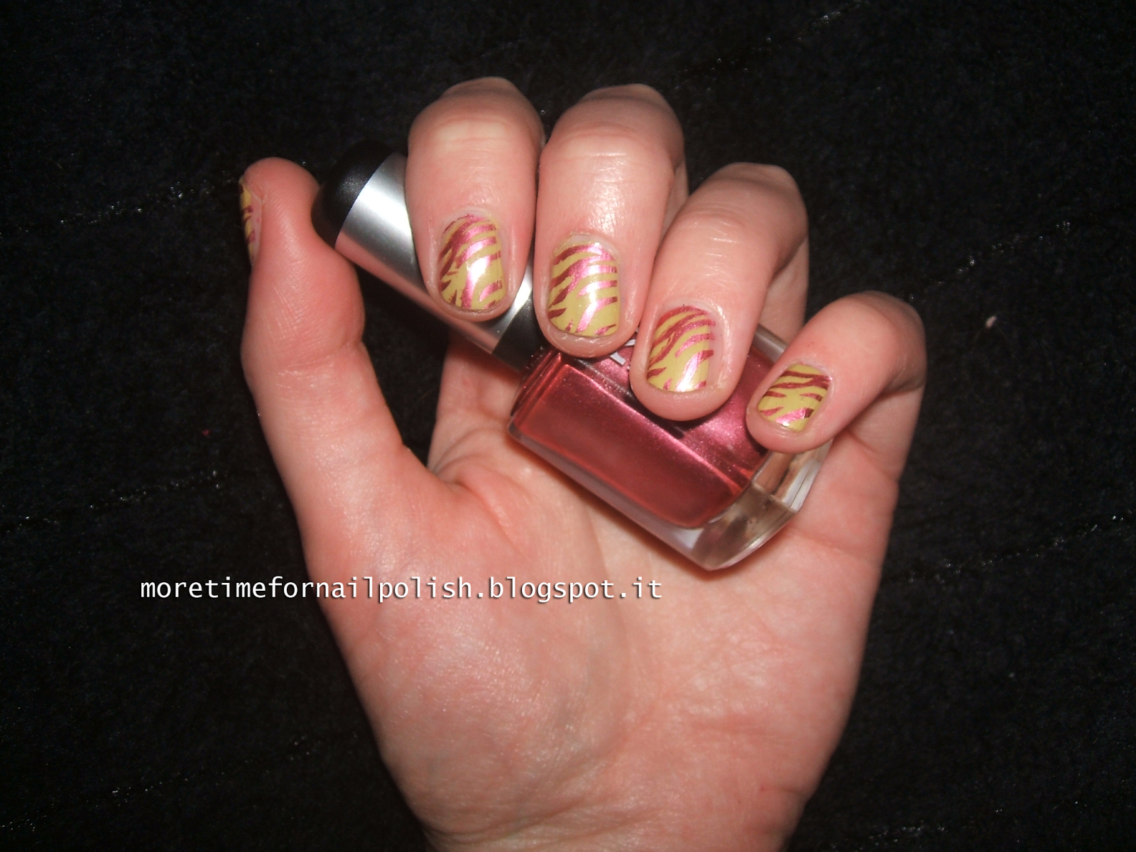
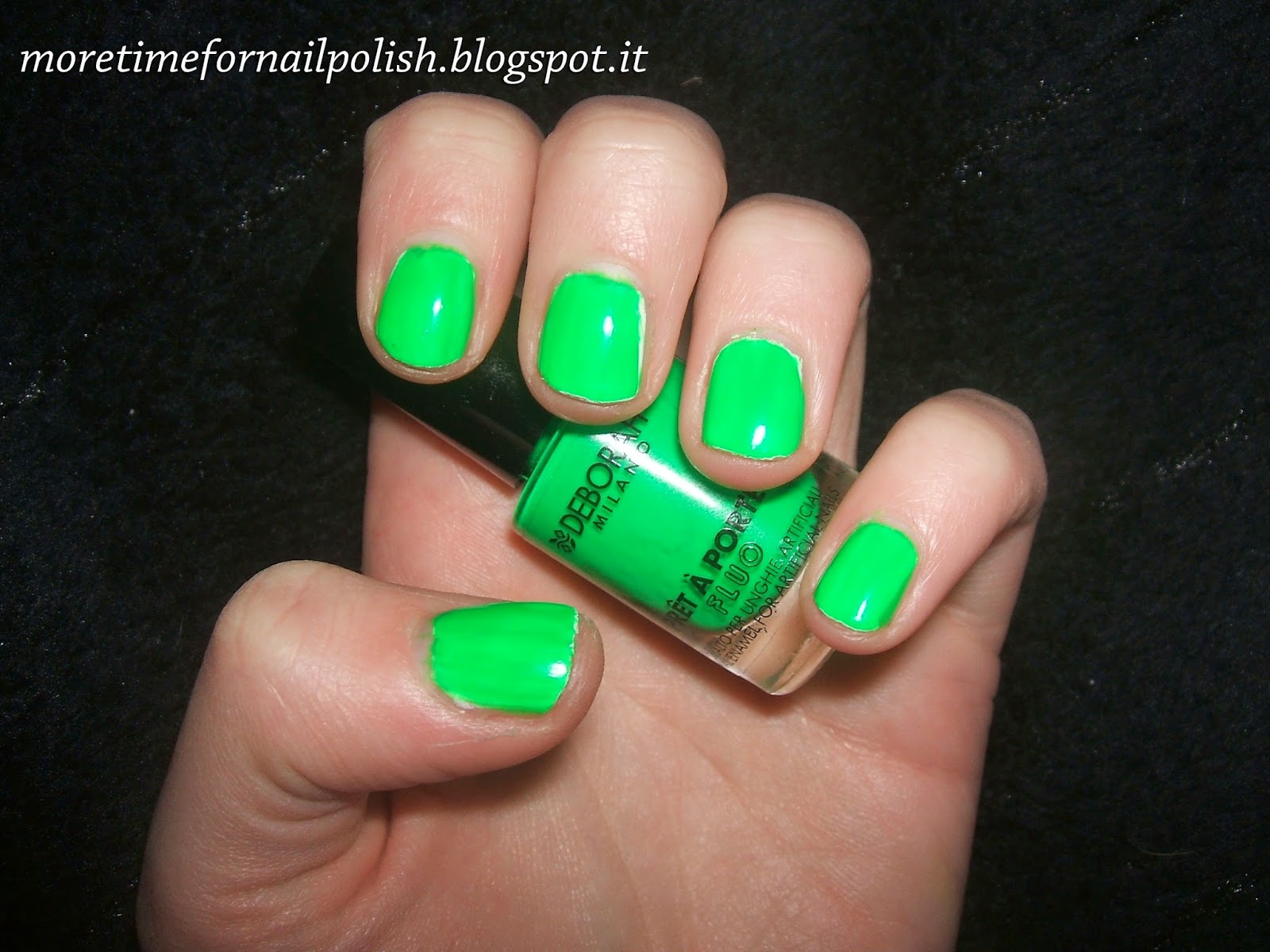
So, I know I have neglected this blog for a while (university, urgh), but now I have the first of what I hope will be a nice series of posts. I will focus on my favorite shades of green when it comes to makeup and nail polish. For nail polish, you can see Deborah Green Fluo 45 that I've been wearing lately. 
I tried to select my 5 favorite green polishes. Not easy!

Besides the Deborah one, I picked Kiko 441 Electron Green, Essence L.O.L, OPI Don't Talk Bach To Me and Essence Choose Me!

Green Fluo 45 is a nice neon green, that like all neons requires a white base. Topped with a shiny top coat it's really nice. Electron Green is a personal fave, annoying to remove for the glitter, but very pretty. I have a thing for lime green, so L.O.L. and Don't Talk Bach To Me (which leans more to pistachio, actually, but whatevs). Choose Me! is a wonderful dragon green (can I define it like that? ), packed with shimmer and awesomeness that got discontinued for no good reason, if you ask me. Essence, seriously, why?

When it comes to make up, I can show you two brushes, one by Neve Cosmetics and the other one by Essence, both definitely good (the Essence one was surprisingly good), a waterproof eye pencil by Sephora that shows how clearly Sephora and me have different ideas of what waterproof means. It's not much resistant and it gets in my crease pretty quickly, it's a pity because it's a wonderful shimmery olive green.
UD eye pencil in Invasion needs no explanations, I believe.. a wonderful matte dark forest green.
For the eyeshadows, there's Concrete Minerals Toxic. I wish it were more on the limey side rather than a pastel green, but I honestly don't care because, like its blue brother, it's greatly pigmented and the quality is amazing.
I included the whole Neve Cosmetics Duochrome palette because all its greens are wonderful. All of them.

What do you think of this series of posts? Any idea for improvement and/or color you really want to see next?


lunedì 7 aprile 2014

Cosmoprof nails + Lemon and Lavender nail art

Before showing you my swatches of my Cosmoprof goodies, I have to show you this cute nail art of mine. Inspired by a Lemon Lavender Yankee Candle that smells deliciously (obviously) and made with Kiko 338, Max Factor Mellow Yellow and Sinful Colors Snow Me White. Sadly Mellow Yellow is very sheer, so it didn't end as I wanted. Still good!


And I forgot to post my Cosmoprof NOTD, so here's what I did with Essence L.O.L. and an Essence tip painter to create a black drop effect. Very simple, but I was too tired to do anything else.

domenica 23 marzo 2014

Green Gradient


Of course, as soon as I said "look, it's sunny, I'll better take a pic of my nails", the sun went away.
Anyway, I hadn't done a gradient nail art in a lifetime so I figured out it was time to try it again. I probably can do better, but I'm still satisfied with the result. I'd love a more blue-to-green effect rather than a dark teal-to-green, and also some other color combinations...
Here I used two Essence polishes, L.O.L., a personal favourite, and 03 Life is a Freeride, from the old Snow Jam LE. If you look at the teal part closely, you can still see the shimmer, and it's something I love.
I'm probably going to add something to this gradient, like a cracking effect or I could use Sephora's arty pois top coat..

martedì 4 marzo 2014

Kiko Cupcake Nail Lacquer 648 & 656

New LE nail polishes from Kiko! As they did with the mirror and the liquid sand last year, this season we have glitter toppers (nothing groundbreaking imho) and those new liquid sand polishes. It was love at first sight when I saw swatches.

They're supposed to look like cupcake frosting. The bottle with the white cap is really cute, and those polishes have an interesting finish.
Matte, they have a base color and particles of other colors in them. Formula-wise I have no complaints, they require two coats for full opacity but dry quickly.
648 is supposed to look like ananas frosting: it's pastel yellow with orange(more) and brown(less) particles.
656 is supposed to look like pistachio frosting: it's pastel green with dark green(more) and orange(less) particles.
Now, the only problem I have with these is that they don't remind me of cupcake frosting at all.
648 reminded me of a potato soup at first, then of rice with saffron and mushrooms, and 656 of a vegetables soup... if it's pistachio why should it have orange particles? I am confused..
Probably they would look more "soft" if layered on a white base, maybe with just one coat. The problem is that the colored particles don't distribute evenly with one coat, sometimes even with two... as you can see from my pinky.

Final Verdict:

Do I like them? Yes, the effect is quite unique and I have nothing like them, and I'd love to try new colors, probably the pink/violet/orange ones will look more like cupcake frosting? yet, the one that intrigues me mostly is 647, Jasmine...

venerdì 17 gennaio 2014

NYC Bronze Metal

When I got Empire Purple I was tempted to buy the other duochrome in the display, and when I tried EP and realized how good it was, I came back next day to buy his fellow, Bronze Metal.


While I couldn't think of a better name for Empire Purple myself, the name of this one left me a bit perplexed, because it's really more than bronze, being a duochrome. "Mother Earth" would be a far better name for it, since it shifts from bronze to green, with golden hues.

The green part is, in fact far more prominent than the bronze one. The color is very unique and I'm definitely satisfied by it. The formula was ok, neither extremely good nor extremely bad, might be a bit streaky so I recommend a perfect smooth base. You'll need at least 2 coats for full coverage (or a white base).

Pretty color, good quality, cheap... no complaints, really! (Vote: A)

sabato 4 gennaio 2014

Kiko 441 Illusion Green- Digital Emotion LE

I'm lucky I bought this before the sales, since I went to a Kiko shop today and the polishes of this line were almost finished...
This one in particular is a super shiny glitter polish. It contains small round and rectangular glitters that reflect the light in a wonderful way, all in a light green base. The intensity of the base is lower than the one of the blue polish of the same edition, and it requires at least 3 coats for opacity. Would look good as a layering polish. It's a really beautiful polish and if you find it in the sales, get it! It's so pretty and eye-catching!
(And, paired with the Seche Vite, even three coats dry pretty quickly).


Vote: A

giovedì 26 dicembre 2013

Christmas beauty-related gifts

Hello! Are you enjoying the holidays? I hope so!
I wanted to show you three beauty products I received this year, who are also my first UD products, not counting the nail polishes.
Do they really need an introduction?

The Naked Basics was on my wishlist for many reasons: it's small, travel friendly and contains beautiful nude matte shades. Small nude palettes are very popular now, but they aren't matte...
I've tried it on Christmas day, and it's just great. The colors are very pigmented (Faint is my new fave brown) and Walk of Shame is a "my lid but better".  I know Venus is a frost/subtle shimmery color, but It's perfect for highlighting needs, so I'm not gonna complain. I can't wait to learn many combinations and makeups with this.

The UD 24/7 Glide-on Eye Pencils are my  new favourite pencils ever. Unsurprising, I know.
Once, I was at Sephora and tried some of them. I fell in love with Uzi, a wonderful gunmetal (with a very appropriate name too). They're soft and allow me to do precise, smooth lines as eyeliner. Uzi might seem too glittery, but it's just metallic and it's a perfect day shade. It has cold undertones and it's just fantastic.
The other one is Invasion, a dark forest green, matte and with cold/blue undertones. It's hard to express how I feel finally owning it, not only because I've desired it for months, but because of the story behind it.
Once I was looking at some online swatches of the UD pencils (I think it was on Sparkage's blog) and was struck by certain color combinations and their names. The matte grey of Desperation, the blue-green of Invasion, the weapon-like grey of Uzi... I fell in love with the color scheme, and started writing a story based on it (inspired by the names too). I haven't finished it yet, but the placeholder title for it is Invasion...
(I plan on connecting that shade to one of my character's outfit).
I feel as if simply staring at it and owning it will help me writing my story.

I hope this doesn't sound too weird... for now, happy holidays! And don't forget to tell me f you received some beauty products for Christmas..

martedì 24 dicembre 2013

Christmas Nail Art

A quick post to show you my Christmas nail art while Trading Places ends... I did the same for the other hand, except I inverted the nail art (red accent). The base is Shaka Emerald, a wonderful festive metallic green. I stamped with my Gals stamping plate some Christmas trees with Pupa 620 and Kiko 628. The Pupa polish stamps nicely, but is not much visible over the dark green, which is a pity. It's still pretty, so who cares? and my fellow nail bloggers have done far more complicated stuff, but with the mince pies to bake and my niece around, well, I didn't have much time... Merry Christmas to everyone!
(I told you this post was quick..)

mercoledì 27 novembre 2013

Textured Triangles


Hello everybody! I have discovered I love OPI's Don't Talk Bach To Me everyday a little more. It's the perfect formula, the perfect finish, the perfect shade of pistachio/acid green. It's a perfect fall/winter shade.
I paired it with another personal fave, a Wjcon sand effect polish, n. 804. It has green/blue reflections so it's perfect! The silver line is Kiko 617.
A bit of texture play is always fun.

mercoledì 13 novembre 2013

Black and white glitter over mint green


Base: E.L.F. Mint Cream. Top Coats: Maybelline Polka Dots 197 Chalk Dust, Essence Matte Top Coat.

I have rediscovered the pleasure of glitter toppers. Especially if mattified. Due to the hex shape of the glitters if I look closely at my nails I feel like I'm watching some molecule or chemical component through a microscope.
Anyway I just wanted to test my other Maybelline Polka Dots polish, the on with black and white glitter on a clear base. I can see myself using it quite a lot, it's very versatile. Good drying time, and the brush catches lots of glitter (this is one coat of glitter). The E.L.F. polish is quite old, but I love the color so I haven't thrown it away yet. And now that I look at it it's the exact same color of my toothpaste.
Well I am getting very random, must be the tiredness... anyway let me know what you think, do you use glitter toppers a lot? Do you wear pastels in fall/winter too?

venerdì 25 ottobre 2013

Rainbow Challenge Day 4, Green Nails

The rainbow challenge continues with this Astra Holo (n 705) I kept exactly for this occasion... a lovely forest green. A pity there has been almost no sun lately, under the light it shines very nicely.
I decided to stamp something over it with Kiko 626, and I went for some leaves... even if I did leaves last time too, the results are quite different. I haven't done stamping in a while but I really love the results, the design came out neatly.

mercoledì 16 ottobre 2013

A multichrome experiment

I've had this mani in my to do list for a while, so I'm happy to have it finally done.
The base is Pupa 209, and the top coats are Deborah 102 for the blue/greenish parts...and a very old L'Oréal Jet-Set polish for the orange/green ones.. It belonged to my sister, and despite being very old I never threw it away, due to its mighty duochrome powers. I kept it thinking to use it for paintings and art, but how could I resist using it on my nails? It looks like some certain high-end duochrome top coats.
It's really old (I wouldn't be surprised to find out it's 10 years old) but still works magnificently.
It has more duochrome fleckes than the Deborah one, and they're bigger overall: one coat of it was enough, while I had to apply 2 covers of the Deborah one to have a better coverage.
The silvery line is Kiko 617.